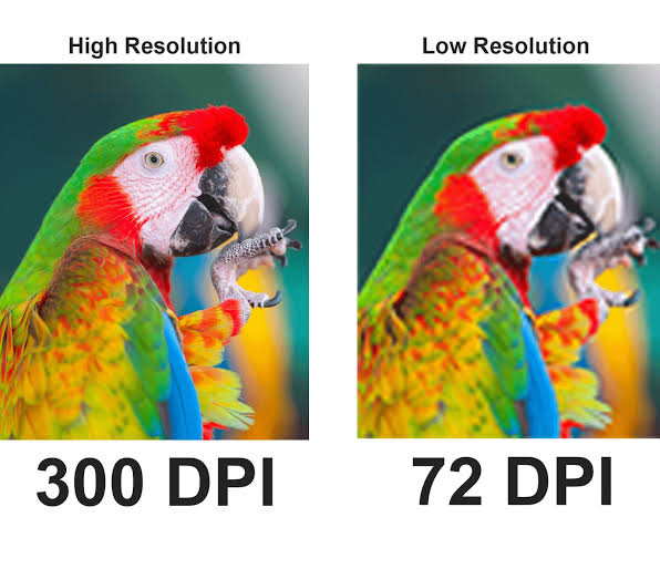
Print needs about four times the resolution a screen does — 300 DPI, not the 72 DPI most phone and web images are saved at. If you're not sure your file measures up, send it with your quote request and we'll help you get it print-ready, no guessing required.
If you've ever sent us a design that looked perfect on your phone and then asked why it printed a little soft, this one's for you.
It almost always comes down to resolution. Not the file size, not the app you used — the actual pixel density of the image.
DPI vs PPI, the short version
DPI stands for dots per inch. It's how many ink dots a printer lays down in one inch of fabric or paper.
PPI stands for pixels per inch. Same idea, but for screens.
Your phone only needs about 72 to 96 PPI to look sharp, because the screen is lit from behind. A printed shirt doesn't have that backlight, so it needs a lot more detail packed into the same space to look just as clean. That's where 300 DPI comes in. It's the standard for a reason: at that density, print comes out sharp instead of fuzzy or pixelated.
Why you can't fix this after the fact
Here's the part that trips people up. You can shrink a high-res image down and it'll still look good. You can't do the reverse.
If a design comes in at 72 DPI and you bump the setting up to 300, the software isn't adding real detail. It's just stretching what's already there, which is why it still looks blurry after the "fix." There's no way around this. If the pixels aren't there to begin with, no software brings them back.
That's also why a photo pulled from Instagram or a Google image search usually won't cut it. Most web images get compressed down to 72 DPI automatically so pages load faster. Great for a website. Not enough for a shirt.
What we actually need from you
Short list before you send a design over:
- Resolution — 300 DPI at the actual size you want printed, not scaled up after the fact
- Color mode — CMYK if you're working in Illustrator or Photoshop. Screens show color in RGB, printers mix it in CMYK, so anything not converted can shift once it hits fabric
- Bleed — an extra 0.125" around any edge-to-edge color, so trimming doesn't leave a white sliver
- Fonts — outlined or converted to curves so nothing gets swapped out on our end
- File type — PDF, PNG, or AI at full resolution. Screenshots are almost never usable
So what if you don't have a 300 DPI file?
Not everyone has one lying around, and that's fine. You've got two options.
First, try to track down a higher-res version. If the design came from a logo maker, a friend's Canva account, or an old flyer, ask if the original file still exists somewhere, not a screenshot of it. Camera photos usually have plenty of resolution too. Check the actual pixel dimensions before assuming it's too small.
Second, just send us what you've got when you request your quote. We'll look at the file and tell you exactly where it stands. Sometimes we can clean it up or work with it as-is. Sometimes the print size needs to come down to match the resolution you actually have. Either way, you're not guessing on your own. We'll walk you through the best version of it before anything goes to print.
The two mistakes we see the most
Pulling from social media or a search engine. Those images are built for fast loading, not printing. Ask for the original file instead.
Skipping the bleed. If your background color runs to the edge of the shirt, tumbler, or card, that extra 0.125" keeps a trimming variance from leaving a visible strip of blank space.
Start every design at 300 DPI from the first click, not as an afterthought. It's a lot easier to shrink a high-res file down than to rescue a blurry one after the fact.